Oh the irony – an article about “annoying mini-banner ads” features said banner, not optimised for the retina screen and featuring something totally irrelevant to me. Let me count the things wrong here:
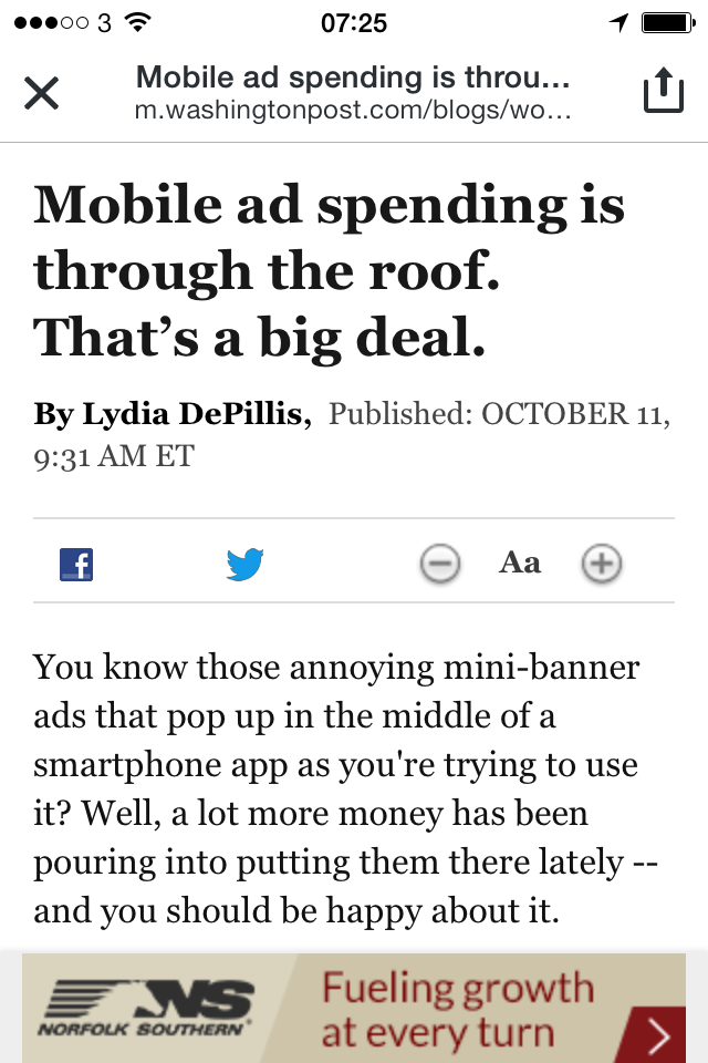
- Banner quality – Low resolution, non-retina optimised. The ad network knows I’m using a modern iPhone, why it still allows bad quality images to be served is beyond me.
- Ad itself – I have no idea what or where Norfolk Southern is but it sure as hell isn’t in the UK (where I live and was browsing).
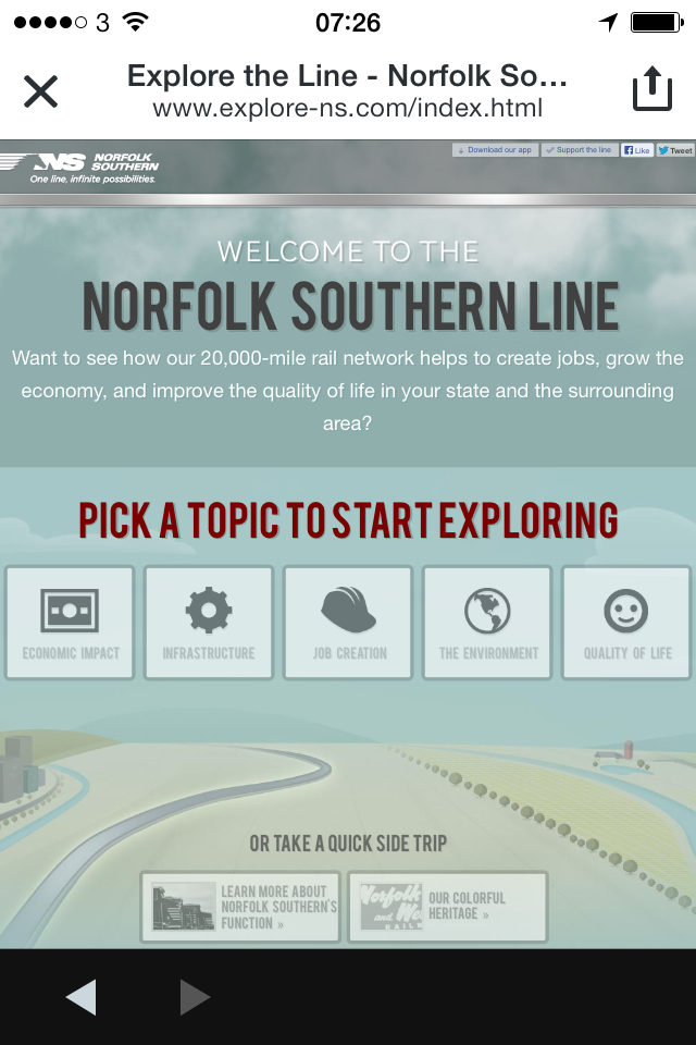
- The site – Confusion continues. What exactly am I being sold? “Pick a topic to start exploring”, seriously? WTF is the purpose of this site?
- The site continued… – It’s not optimised for the mobile screen. Enough said.
It’s the ultimate #firstworldproblem but it really rubs me the wrong way (as I work in the industry) that we can’t get it right. I guess the 90s aren’t over yet in the world of mobile advertising.